When it comes to creating a logo, there’s no one-size-fits-all approach. Different businesses have different needs, and that’s where the variety of logo types comes in. Whether you’re looking for something sleek and modern or traditional and authoritative, the right type of logo can make all the difference in how your brand is perceived.
Let’s break down the different types of logos and explore how they’re used in the real world, along with examples to help guide your decision.
1. Wordmarks (Logotypes)
A wordmark is a logo built entirely from the business name using custom or stylized typography. It’s a clean, straightforward approach, ideal when your business name is strong and memorable. Since the focus is on the name, the typography must be unique to ensure it stands out.
Use case: Wordmarks are perfect for businesses with distinctive names that are easy to recognize and remember. This approach works well for tech companies, fashion brands, and any business where the name is central to the brand identity.
Examples:
- Google: Simple, recognizable typography with a colorful touch, reinforcing their playful yet professional tone.
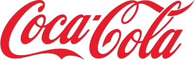
- Coca-Cola: Their custom script is iconic, embodying both the history and the classic feel of the brand.
Best for: Brands that want their name to be the focal point and already have strong brand recognition or need a straightforward, minimalist approach.
2. Lettermarks (Monograms)
A lettermark is similar to a wordmark but focuses on the initials of a brand instead of the full name. This type of logo is ideal for companies with longer names or those looking for a more compact, versatile design. The initials are stylized into a visual identity that becomes instantly recognizable.
Use case: Lettermarks are great for companies with lengthy names or ones that are already widely known. They provide a clean, concise way to represent your business while keeping it professional.
Examples:
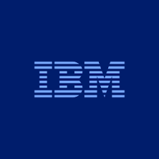
- IBM: The three-letter mark is minimal and streamlined, fitting for an industry giant in tech.
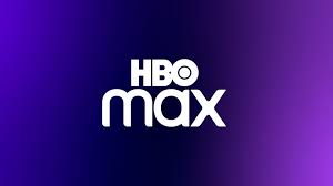
- HBO: Short, bold, and to the point, just like the content they provide.
Best for: Companies with long names or those that are looking for something simple, professional, and easy to reproduce across different platforms.
3. Pictorial Marks (Iconic Logos)
A pictorial mark is an image-based logo that often becomes synonymous with the brand itself. These are usually simplified, memorable icons that represent a company without any text. These logos work best when the brand is already well-known, as the image needs to be strong enough to stand on its own.
Use case: If your brand already has a strong reputation, a pictorial mark can be a powerful representation. They’re often seen in technology, sports, and retail industries where the symbol becomes globally recognizable.
Examples:
- Apple: The bitten apple is iconic and instantly connects consumers to the brand’s values of innovation and simplicity.
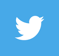
- Twitter: The bird alone has become a symbol of communication and connection without needing the platform’s name.
Best for: Established brands looking to create a strong visual identity that can stand on its own without text.
4. Abstract Marks
An abstract logo is a symbol that doesn’t represent a literal object but instead uses shapes or forms to convey an idea or feeling. These logos are highly conceptual and allow for a lot of creativity, but they need to be carefully crafted to resonate with the brand’s core message.
Use case: Abstract marks are great for businesses that want to express a concept or value without being tied to a specific image or industry. This style is common among technology, finance, and design companies looking for a more modern, flexible identity.
Examples:
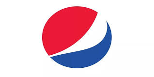
- Pepsi: The circular shape with its red, white, and blue waves is abstract but communicates energy and refreshment.
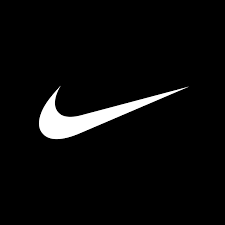
- Nike: The swoosh is simple but represents speed, motion, and athleticism, aligning perfectly with the brand.
Best for: Businesses that want a unique and flexible symbol that isn’t tied to a specific, easily recognizable image.
5. Emblems
An emblem logo is where text is placed inside a symbol or icon, often giving it a badge-like appearance. These logos are typically more intricate, with a traditional feel, and work best when you want to convey authority, heritage, or prestige.
Use case: Emblems are widely used in industries where tradition and heritage are important, like schools, government organizations, and sports teams. They work well for businesses looking to establish a sense of longevity and trust.
Examples:
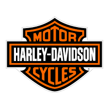
- Harley-Davidson: The iconic shield-like emblem immediately conveys power, tradition, and loyalty.
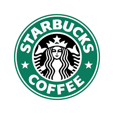
- Starbucks: The mermaid inside the circular design feels timeless, evoking tradition with a modern twist.
Best for: Institutions, heritage brands, or any company looking to convey a sense of history or authority.
6. Combination Marks
A combination mark combines both text (either a wordmark or lettermark) and a symbol or icon. These logos offer the best of both worlds, as the text helps with recognition while the icon reinforces the brand’s identity. Over time, businesses can drop the text and rely solely on the icon if the logo becomes widely recognizable.
Use case: Combination marks are incredibly versatile and are a good fit for almost any business. They provide flexibility, as the symbol and text can be used together or separately, depending on the context.
Examples:
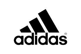
- Adidas: The three stripes paired with the brand name make for a logo that’s athletic, bold, and instantly recognizable.
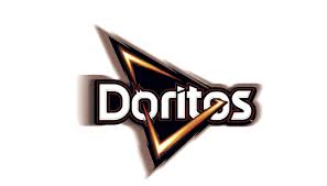
- Doritos: The text combined with the triangle-shaped chip graphic is both fun and memorable, reflecting the brand’s playful personality.
Best for: Newer brands looking to build recognition while allowing room for future evolution.
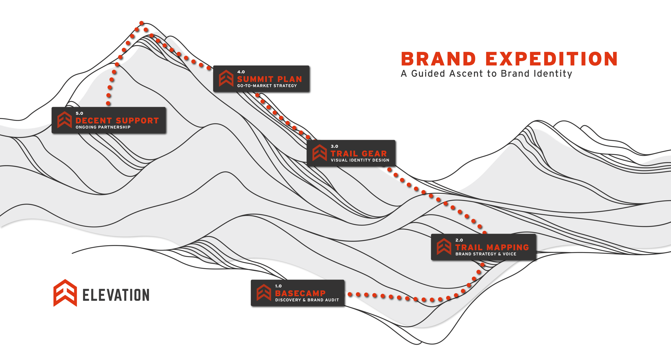
Choosing the Right Type for Your Business
When selecting the right type of logo for your business, consider factors like your brand’s personality, your industry, and how your logo will be used. Logos are more than just decorative—they serve as the cornerstone of your brand’s identity. At Elevation Design Co., we specialize in creating logos that not only look great but fit seamlessly into a larger brand system, ensuring consistency across all your touchpoints.
Need help crafting the perfect logo? Whether you’re after a sleek wordmark or a bold emblem, we’re here to elevate your brand.