A Friendlier IT Product
In the ever-evolving world of cybersecurity, a groundbreaking product emerged to address the pressing need for a unified and user-friendly IT security solution. This innovative platform aimed to empower IT teams by providing a centralized portal for monitoring and responding to cyber security events, while effectively highlighting potential vulnerabilities.
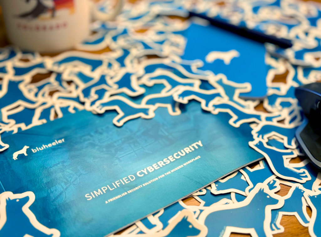
Crafting a brand identity for this intricate and indispensable product presented a unique challenge. The objective was to express its complex functionalities in a relatable and humanistic manner, capturing the essence of alertness, responsiveness, and approachability. Thus, the name Bluheeler was conceived.
Bluheeler, a clever wordplay combining “blue” to signify seriousness and “heeler” implying a solution, became the embodiment of this visionary product. The brand image took the form of a silhouette inspired by the elegant Blue Heeler dog breed, deviating from the conventional B2B tech logos and instantly captivating attention at industry conventions. The dog logos quickly gained popularity, positioning the brand emblem to become a recognized and iconic symbol.
The journey of Bluheeler commenced with a mission to revolutionize the cybersecurity landscape, bridging the gap between advanced technology and relatability. It evolved into a symbol of trust, reliability, and innovation, setting the benchmark for comprehensive cybersecurity solutions.
Today, Bluheeler stands proudly at the forefront of the market, offering organizations an all-encompassing cybersecurity solution, backed by a compelling brand narrative. Its remarkable journey exemplifies the fusion of cutting-edge technology with a personable approach, forever redefining the way businesses safeguard themselves in the digital realm.
Website Design
The Bluheeler website was meticulously crafted to not only educate, but also captivate and inspire visitors. Unlike its competitors, who clutter their sites with endless links and pages, the Bluheeler site design was optimized with a singular objective in mind – to convert interest and capture valuable leads.
The design style employed for the website is a perfect blend of modernity, sleekness, and boldness. Every element has been carefully curated to create a visually stunning experience for users. One notable aspect of the design is the strategic use of negative space, which not only enhances readability but also facilitates easy scanning of content. The deliberate placement of elements and the generous use of white space allows visitors to focus on the most important information, without feeling overwhelmed.
Colors play a crucial role in the design, serving as visual cues to highlight relevant details and guide users through the site. The use of a reversed, white text on a dark background not only adds a touch of sophistication, but also contributes to improved readability. This design choice aligns with current interface design trends, creating a seamless and consistent user experience.
In summary, the Bluheeler website stands as a testament to thoughtful and intentional design. Its educational and exciting nature, combined with its modern and sleek aesthetic, make it a powerful tool for conveying the brand’s message and capturing the attention of potential customers.

An Empowering Emblem
The dog emblem played a pivotal role in various aspects. It not only symbolized the strong bond between a dog and its owner, but it also represented the valuable partnership between Bluheeler and IT specialists. Just like a loyal and reliable companion, Bluheeler became the go-to solution for IT professionals, offering them the support they needed to tackle complex cybersecurity challenges.
By assuming a supporting role, the brand allowed the IT user to take on the role of the hero in marketing messages. This strategic approach created a sense of empowerment and positioned the IT specialist as the central figure in the narrative. To further enhance this concept, I even developed a superhero motif, featuring the dog emblem prominently on the chest of the superhero technician. This creative representation not only captured attention but also reinforced the idea that Bluheeler was there to assist and empower IT professionals in their daily tasks.
One of the remarkable aspects of a well-designed brand or product is its utility. It serves as the superpower that allows designers to think outside the box and seamlessly integrate the brand into various situations. With Bluheeler, utility became the driving force behind the brand’s design and product development. It provided designers with the freedom to think creatively and associate the brand with real-world scenarios that would otherwise seem contrived. This approach not only added authenticity to the brand’s image but also enabled users to connect with it on a deeper level.
In summary, the dog emblem of Bluheeler served as a powerful symbol of trust, reliability, and innovation. It allowed IT specialists to shine as the heroes in marketing messages and created a relatable and humanistic connection between the brand and its target audience. The utility of the brand design further enhanced its effectiveness by enabling designers to seamlessly integrate the brand into various situations, making it a truly versatile and impactful solution in the cybersecurity landscape.