REBRAND OF S&T COMMUNICATIONS
A Brand for Humans, by Humans
PROJECT SCOPE
Create a new brand identity, better segment, or divide, the customer base into groups of individuals with specific needs and interests. Identity the most relevant and unique value propositions to each group.
Background
S&T was founded as a Cooperative in 1952, to provide much needed rural telephone service in western Kansas. Eventually, Cable TV and High-Speed Fiber internet were added as core services. Although still a Cooperative, S&T has expanded its geographic reach beyond the 9 ILEC exchanges, providing CLEC services to Goodland and Colby Kansas. In 2019, as part of a rebrand, we established separate business divisions for Residential, Business and Advertising services. An additional division, S&T Community, was also established to better focus on community development efforts and charitable contributions.
Objectives
- Use contemporary design styles & principles to create a better visual representation of our modern services and technology.
- Create separate brand divisions (home, business, advertising, & community) to better focus the right marketing messaging to the right target market.
- Position the company for growth into new service offerings, without sacrificing brand recognition and consistency.
BRAND IDENTITY

Designing a Brand System
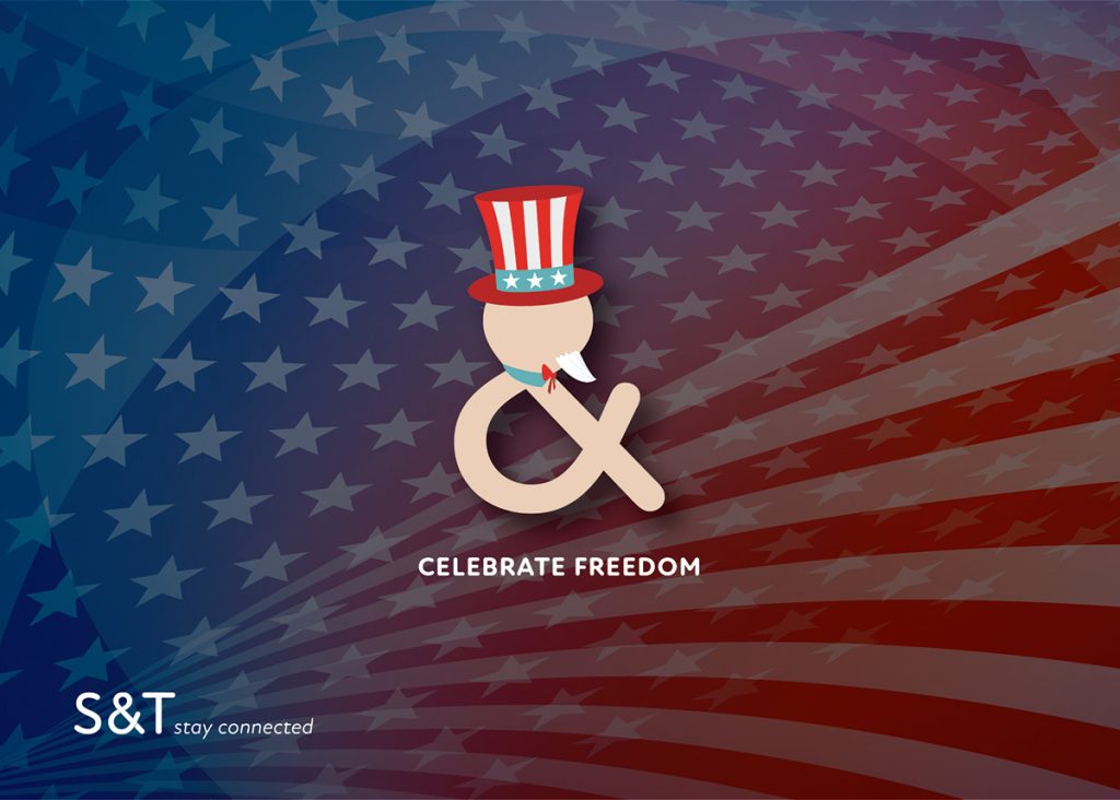
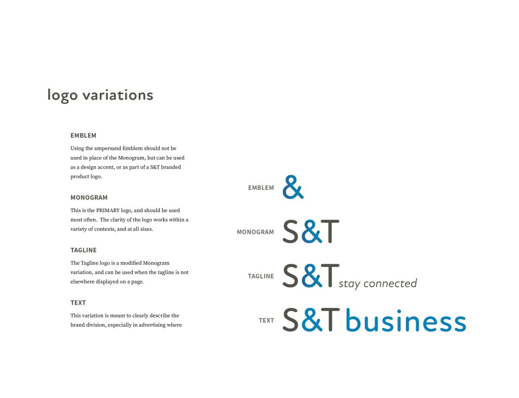
The ampersand is the focal point of the logo. The variations in color directly correspond to the applicable brand division. The shape was designed to represent the flowing connectivity of the modern world, but this doesn’t mean we can’t have fun with the brand and create holiday characters.
The Utility of Color
Color plays a vital role in visual communication and can significantly influence how a brand or message is perceived. In the context of the S&T Rebrand, the selected color palette serves multiple purposes. Each color represents a distinct brand division, establishing separate identities visually. Furthermore, the colors were chosen based on their psychological attributes, aiming to evoke specific emotions and create a dynamic and contemporary atmosphere. By strategically utilizing color, S&T can effectively convey its message, elicit desired reactions, establish visual hierarchy, and group information cohesively.
MARKET STRATEGY
A New Purpose
The new tagline “stay connected” works on multiple levels. It not only reflects the nature of the services offerED (telephone, cable, and internet), but it also implies the significance of the cooperative in staying connected to the founding communities. S&T used this tagline as a mantra to drive community engagement.
The new vision statement was developed to serve as a unified purpose for all divisions: to keep people connected.
New Personas
The goal of the rebranding is to effectively segment the customer base into distinct groups based on their specific needs and interests. This segmentation allows S&T to tailor value propositions more intentionally to each group. These personas play a crucial role in shaping the narratives of future campaigns and enable everyone to empathize with the needs of our customers.


Messaging That Connects
S&T’s marketing messages underwent a significant transformation. Instead of solely emphasizing the features and details of the products, the new approach now revolves around the importance of family connections and the value of connecting with customers. We believe that by shifting our focus to these aspects, we can establish a deeper and more meaningful relationship with our target audience.
The essence of the new brand lies in the power of storytelling. We understand that it’s not just about telling any story, but about telling the right story to the right people. By crafting narratives that resonate with our customers’ desires, aspirations, and values, we can create an emotional bond that goes beyond mere product promotion.
The goal was to engage the audience on a personal level, to make them feel understood and connected. We want customers to see themselves in the stories, to envision the possibilities and the positive impact the products can have on their lives. Through this approach, we aim to foster a sense of loyalty, trust, and long-term relationships with our valued customers.
In conclusion, our marketing strategy has shifted towards a more customer-centric and emotionally-driven approach. By focusing on family connections, emphasizing the value of connecting with customers, and telling the right story to the right people, we believe that S&T can create a stronger brand presence and cultivate deeper customer relationships.


Brands Can Be Fun!
To further distinguish the brand from a high-tech, un-relatable image, we have utilized the emblem to create whimsical characters that add a touch of fun and playfulness to our brand identity. These characters embody the spirit of S&T and help us connect with our audience on a more personal level.
By incorporating these whimsical characters into the brand, we aim to break the stereotype of a technology company being cold and distant. Instead, we want to convey a sense of approachability and warmth. These characters not only bring a smile to customers’ faces but also make the brand more relatable and memorable.
Through the use of these characters, we can inject personality into our marketing materials and campaigns. Whether it’s through illustrations, animations, or stories, these characters create an emotional connection with our audience. They serve as friendly ambassadors of our brand, fostering a sense of trust and familiarity.
By embracing whimsy and incorporating these characters into our visual communication, we can differentiate ourselves from the competition and create a brand that is both memorable and enjoyable. These characters help us showcase the human side of our brand, making it more relatable and inviting.